

Anybody else think CH should get a new color scheme? I think the orange is fine but they use too much gray. I like the way the trainers with the box art look, but the other kind are just big gray boxes with orange text and they look rather blah. I know we barely look at the actual trainer when using them but still.
Get someone to make a custom skin for it over at userstyles.org. Otherwise it pretty much won't happen. I think this was already discussed with PWiz.

Anybody else think CH should get a new color scheme? I think the orange is fine but they use too much gray. I like the way the trainers with the box art look, but the other kind are just big gray boxes with orange text and they look rather blah. I know we barely look at the actual trainer when using them but still.
90's trainers or smooth morden style to it and do their job. They are not really supposed to look like disco partys or a banner fest. Calls are fine. I feel no need to change those two kinds at all.
Plus I have always loved the CH Colours. It stands out. It Classic Nood need to change something that is not broken.
We could all just threaten to go on strike, quit playing games and using Trainers unless we get a dazzling new facelift. That'd teach em. OK, so who wants to go first?
Are you mental. I need my constant fix man..... I cant go 2milli seconds without hearing that sweet activated.

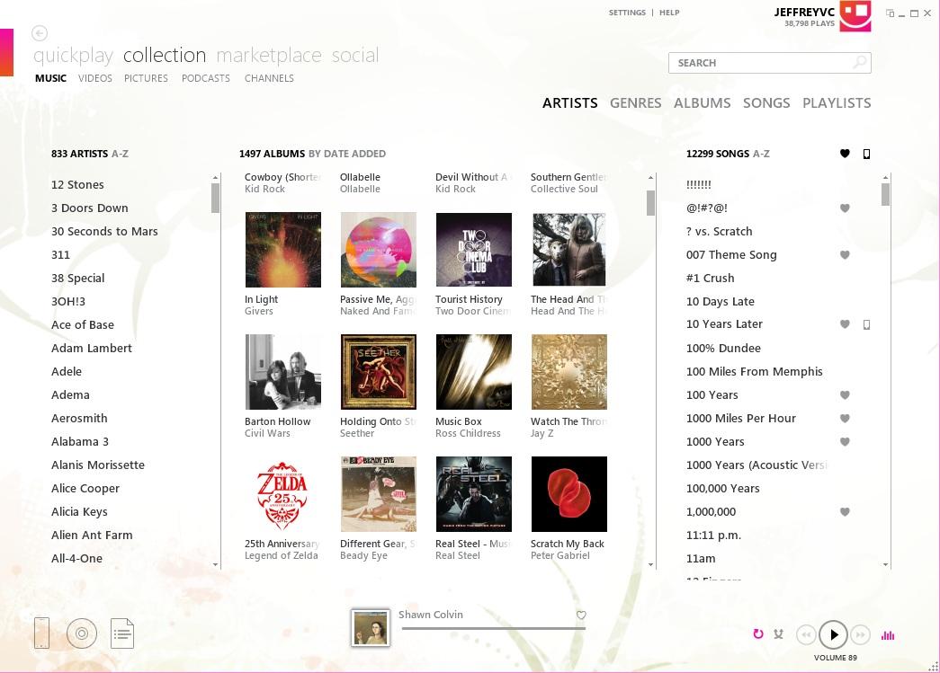
In terms of UX design I was actually a huge fan of the way Microsoft did their Zune software:
Link
They even released an API for others to follow that particular design and Ceton is the only company I know of that ever used it (they make TV Tuners and other Media Center stuff). It's a shame it was short lived.
Any chance that's the wrong link?
That or my mouse pointer is broken.