
I can see it.
Wiseguy. lol I could see it, just didn't relate.
You think there's another layout that would increase user appreciation or interest in trainers? How would you do it, like game on one side, trainer on the other? Or category-game or something like that?
BTW, is the CH website a canned package or a straight-up custom job?
[Edited by element5, 5/21/2014 8:42:46 PM]


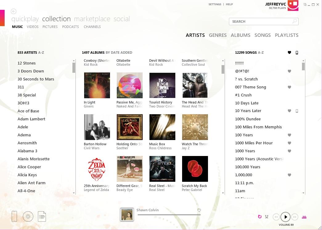
In terms of UX design I was actually a huge fan of the way Microsoft did their Zune software:
Link
They even released an API for others to follow that particular design and Ceton is the only company I know of that ever used it (they make TV Tuners and other Media Center stuff). It's a shame it was short lived.
That actaully looks very nice. Professionl looking with a nie touch to it. Altho the rectangle block of colour on the left and the square on top right just looks odd. Other than those two issue that layout looks Nice and pro looking


It looks good how it is. It's crisp and clear and not likely to be mistaken for anything else. Functionality is more important than design and this works perfectly.
While I like the example shown in the link, I prefer the colors and set-up that is currently in use. It works and is streamlined. I agree functionality is a must over looks.